Call To
Action
I helped Killer Creamery (formerly known as Killer Whey) when they were first starting out in Boise, ID. Louis needed a website and some social media a-sap. And after working with this business from the ground up, I'm so proud of how far they've come. In this preview, I'm going to demonstrate a pitfall I solved for the users.
Killer Creamery:
Louis started this business out of his own home, and after he got his product into a couple local Winco locations, he needed a website and social media fast.
The basic website was built that had a number one priority of informing the users about the product, because now locals were finding and buying the product and looking for a website to learn more.

New Link:
The business grew and they expanded to more locations, so the simple map at the bottom of the webpage wasn't cutting it. We created a 'Locations' link in the menu for quick access.
Below is how the website has looked for quite awhile.

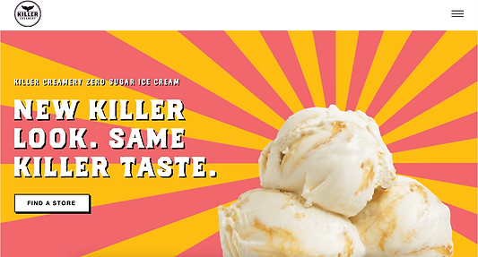
Pain-Point:
The website became shared with friends and family who also wanted to try the new protein ice cream, and finding a store location became the target audience's main priority. . The audience already knew they wanted the product because of word-of-mouth, so the details about the product became background noise and no longer the focal point of the website.
Directing more people to the locations was far more important and the old design had become a pain-point for many users, even with the 'Locations' link in the menu bar.
We simplified the navigational items with a hamburger menu, and placed a white focal-point button on the main screen. Success.